Designing a website for StratiFi, risk analysis software for wealth managers
How we made risk analytics feel clear, credible and easy to start with.

StratiFi helps advisors profile risk, analyse portfolios and stay compliant in one place. The site had to win over busy wealth managers fast.
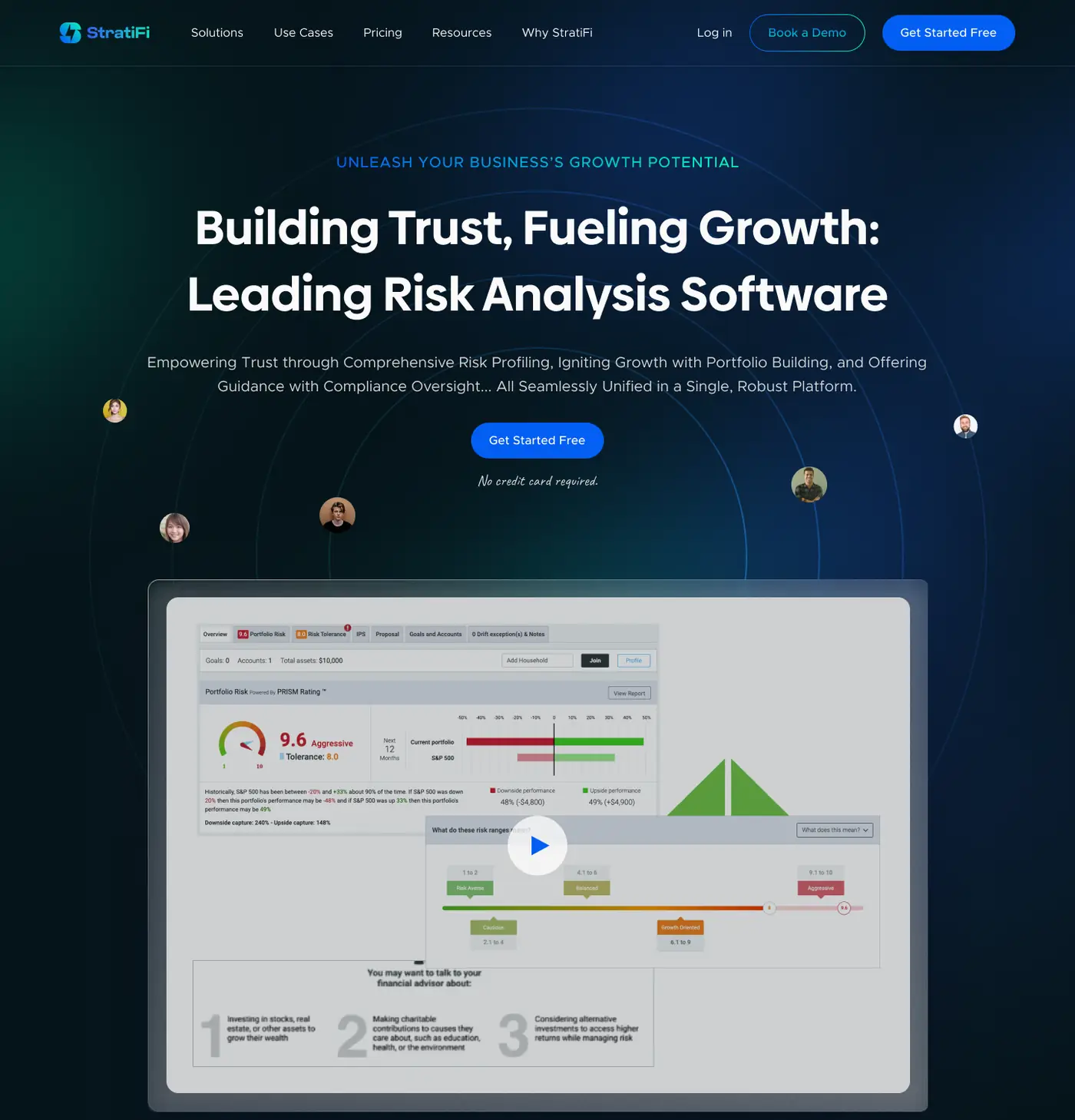
We designed the full StratiFi website with a deep navy hero, the real product front and centre, and three simple steps that explain the whole workflow.
Deep navy, bright blue, all business.
A dark navy hero gives it weight, a bright blue drives every action, and white sections keep the detail readable.
Details that do the explaining.
Scroll through the page with us. The view moves to each decision as you read.
The first screen
A clear headline over the real product dashboard.
Building trust, fueling growth
The headline says exactly what the software does.
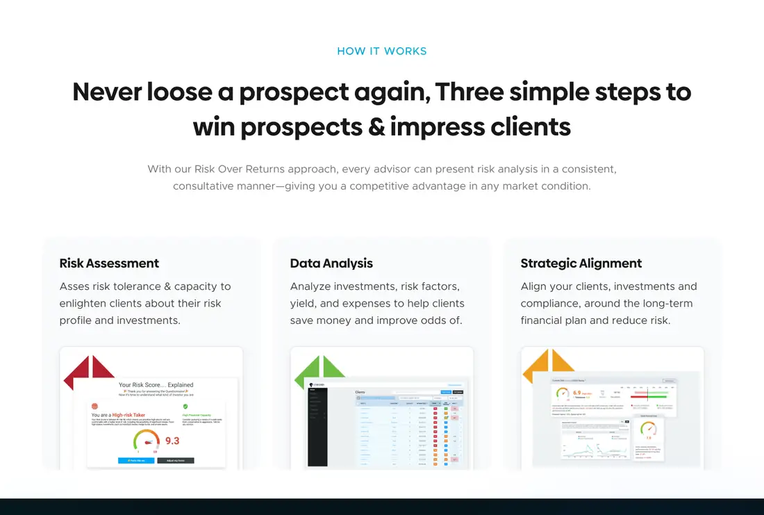
Three simple steps
Risk assessment, data analysis and strategic alignment, each with a real screen.
Hear from your peers
A testimonial band backed by three big numbers.
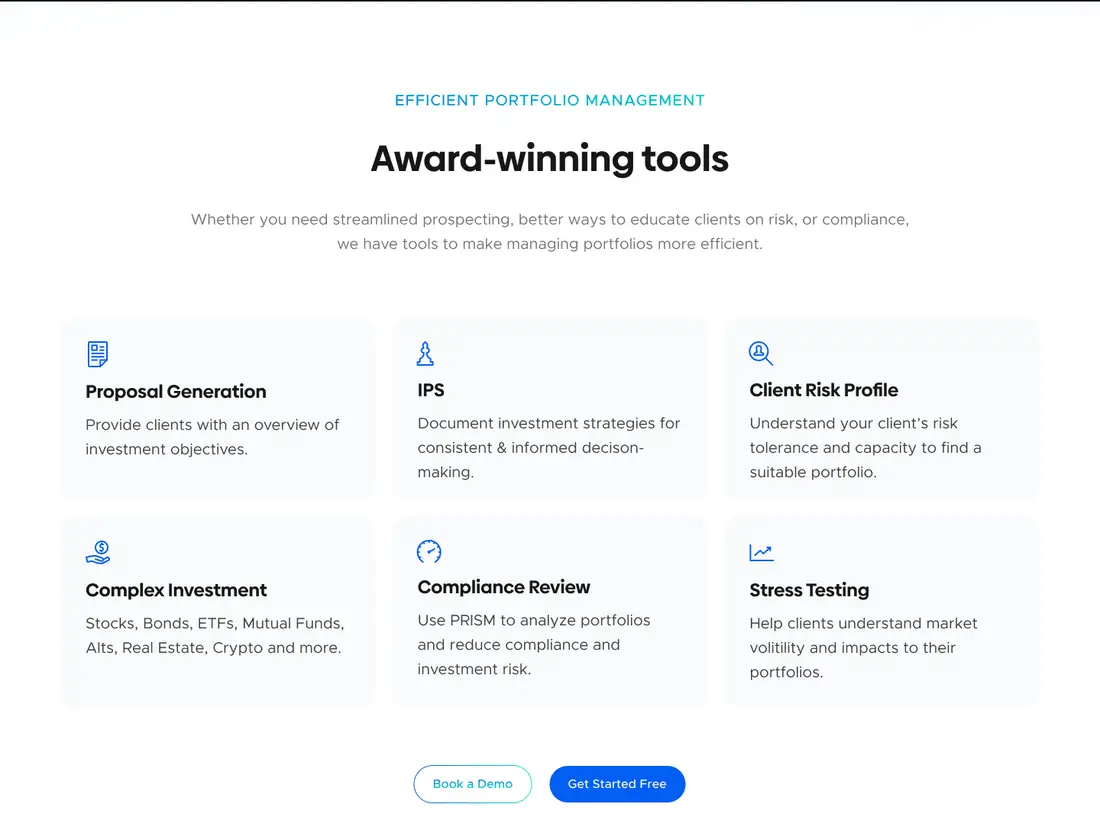
Award-winning tools
Every tool in a clean grid, easy to scan.

Up close.
Sections straight from the design. Drag to explore.

How it came together.
One shared file and short loops between design and build.
Understanding the product and how advisors use it.
Turning the workflow into three simple steps.
Designing every section around the real product.
Built and launched at stratifi.com.
In their words
More work we’re proud of
Two more projects, designed and built end to end.

