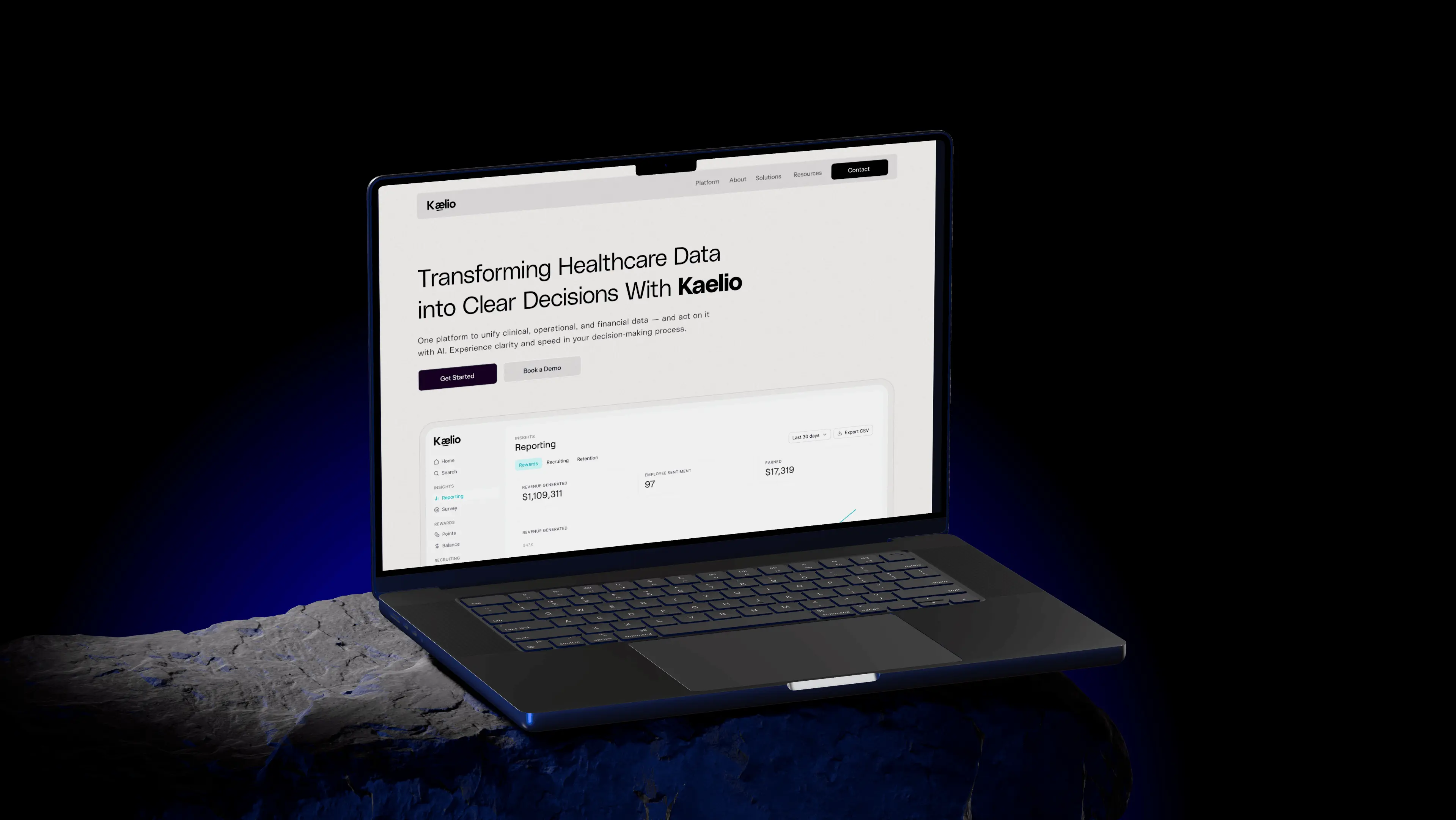
Designing a website for Kaelio, the open-source context layer for data agents
How we made a deeply technical product feel simple enough to try on the first visit.
ktx gives data agents the business context they need to answer accurately. That is a hard idea to sell to people who have never seen it. The site had to make it obvious.
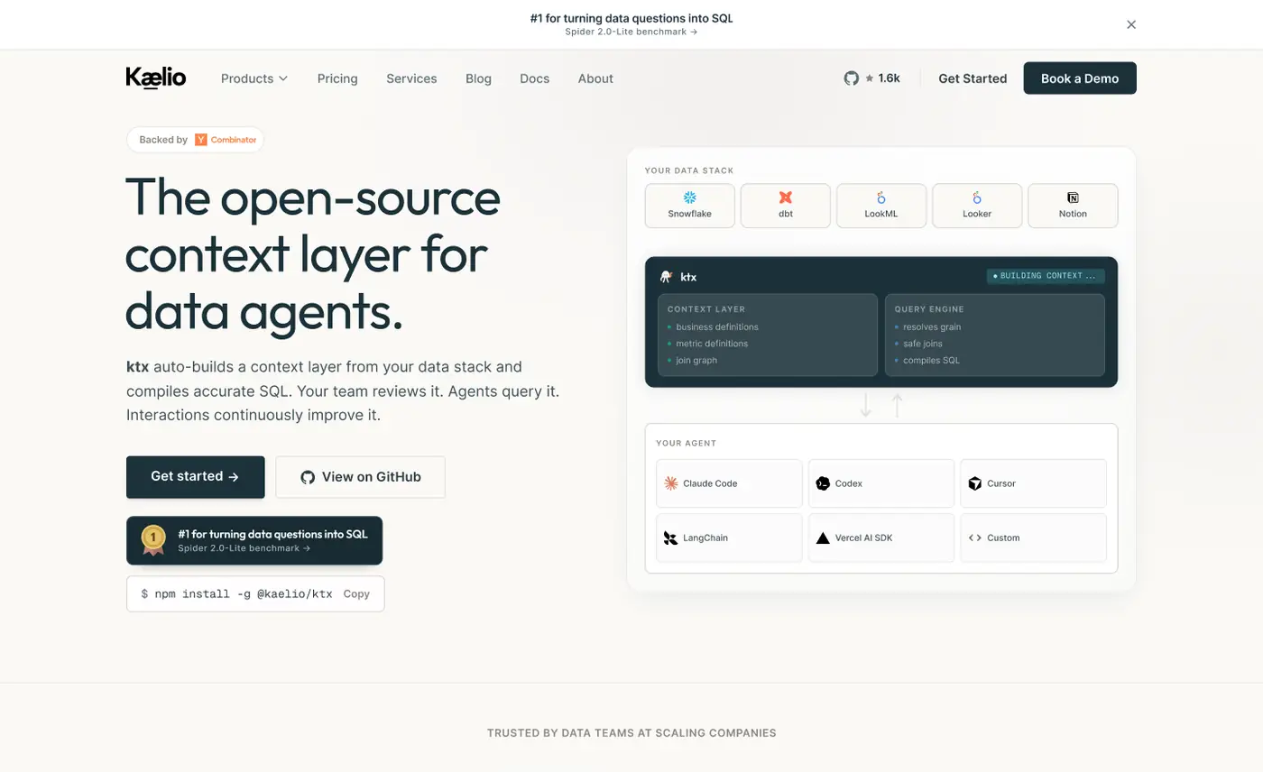
We designed the full Kaelio website around one move: show the problem, then show ktx fixing it. Real interface, plain language, and room to breathe between every idea.
Calm, technical, and quietly confident.
A warm off-white base, a deep teal for the product, and small orange moments for emphasis. Code and UI sit inside clean cards so the page reads like documentation, not marketing.
Details that do the explaining.
Scroll through the page with us. The view moves to each decision as you read.
The first screen
Headline, one line of explanation, and the product right beside it.
One clear promise
“The open-source context layer for data agents.” Nothing else competes with it.
Before and after
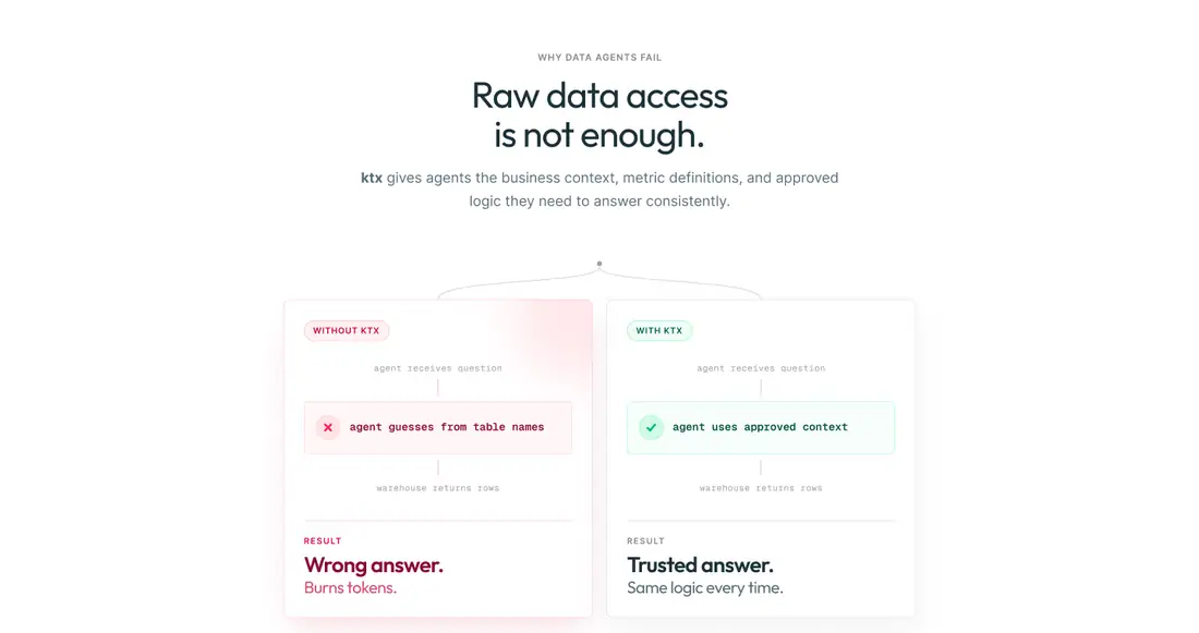
Wrong answer versus trusted answer, side by side, so the value lands in seconds.
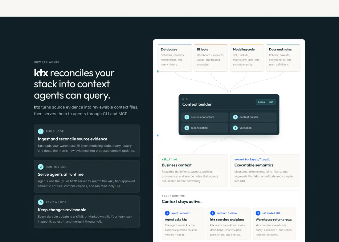
How ktx works
A dark section that walks through ingest, runtime and review as one simple diagram.
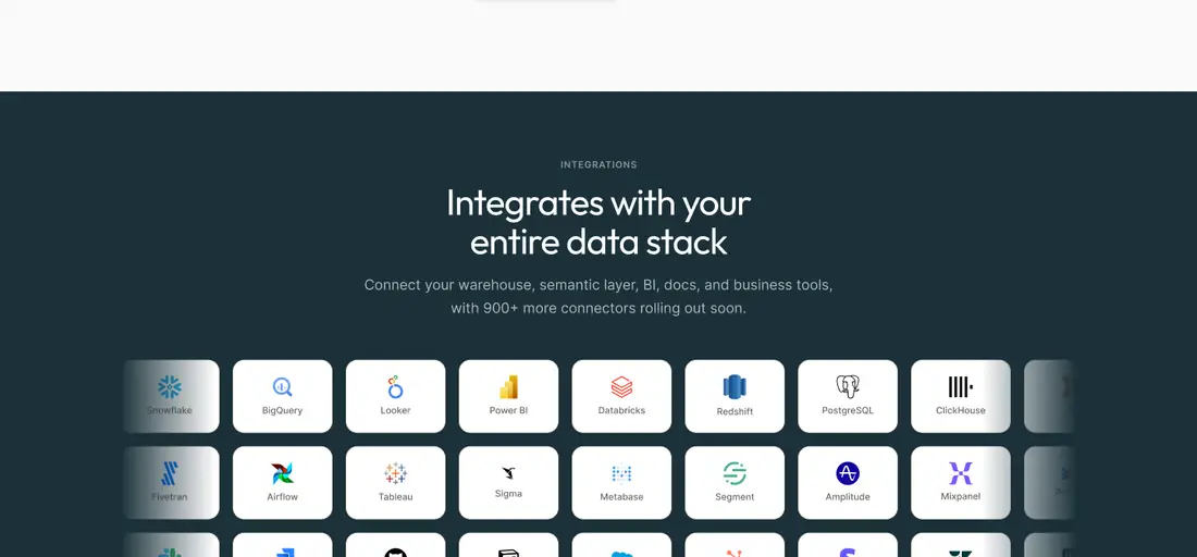
Fits the stack
Every integration in one grid, so teams can see their tools without searching.

Up close.
Sections straight from the design. Drag to explore.
How it came together.
One shared file and short loops between design and build.
Understanding ktx and who it is for: data teams building agents.
Mapping each section to one question a technical buyer asks.
Designing the full page in one shared Figma file.
Built in Webflow and launched at kaelio.com.
More work we’re proud of
Two more projects, designed and built end to end.