Designing a website for Harmonic Discovery, engineering a new generation of therapeutics
How we gave complex science a warm, human and memorable face.
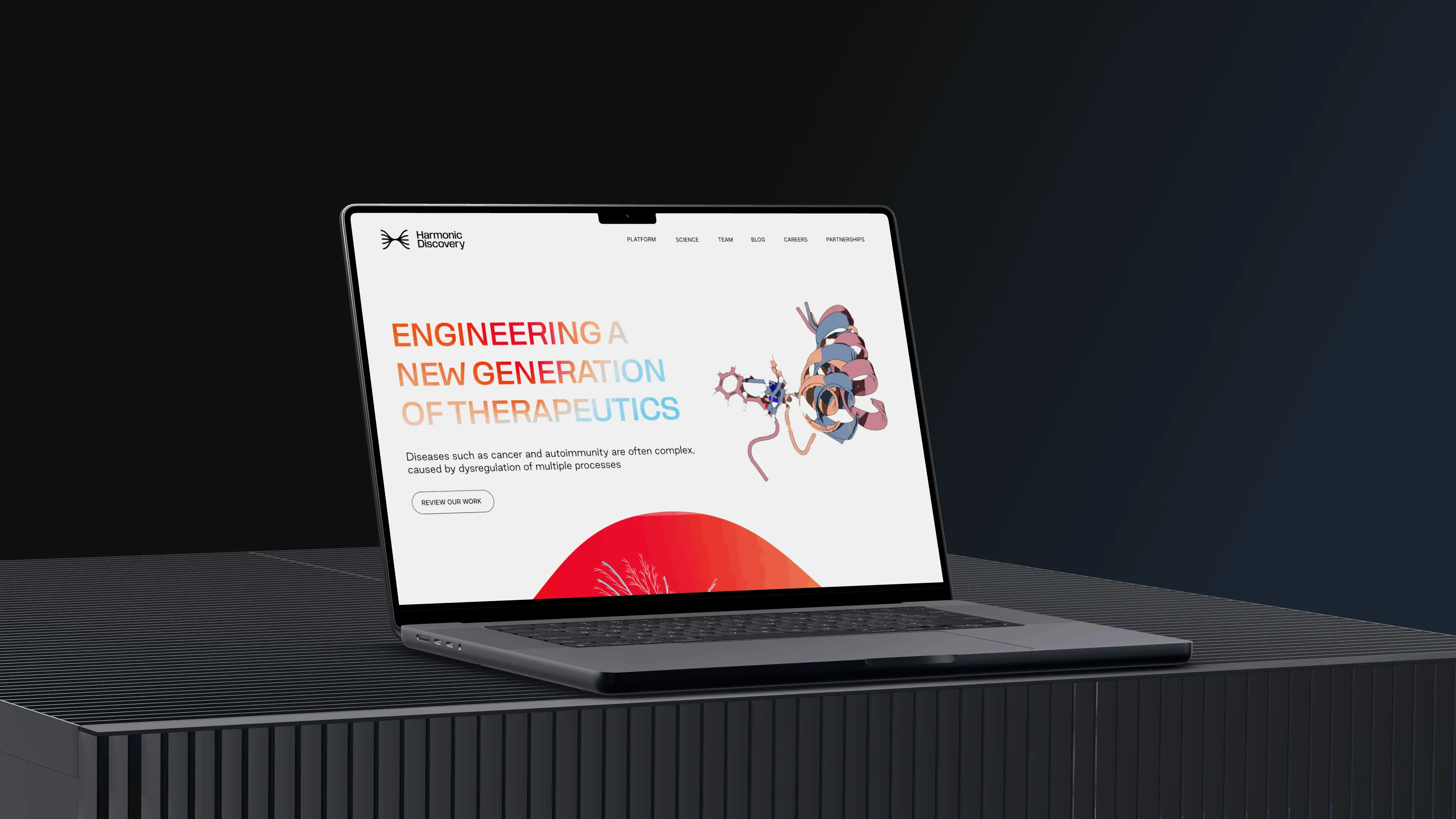
Harmonic designs drugs that target several biological processes at once. The science is deep. The website had to make people feel it before they understand it.
We designed the full Harmonic Discovery website with a bold gradient, flowing line art and generous type. Each section carries one idea, from the platform to the team behind it.
A gradient that feels like biology.
Red flowing into coral and sky blue gives the brand energy, while black type and white space keep it credible for scientists and investors.
Details that do the explaining.
Scroll through the page with us. The view moves to each decision as you read.
The first screen
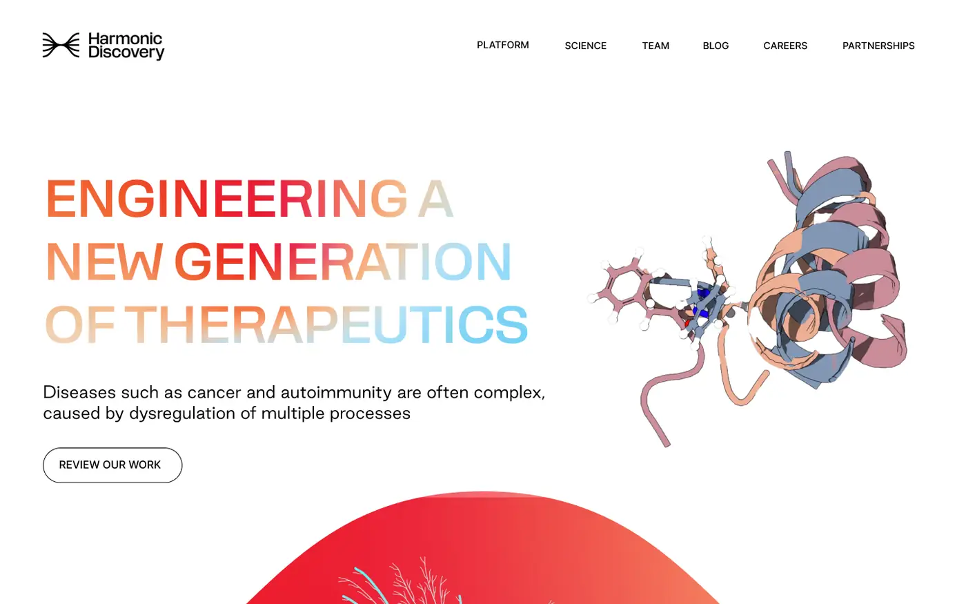
A gradient headline and a 3D protein structure set the tone straight away.
Engineering a new generation
The headline carries the gradient, so the brand shows up in the very first words.
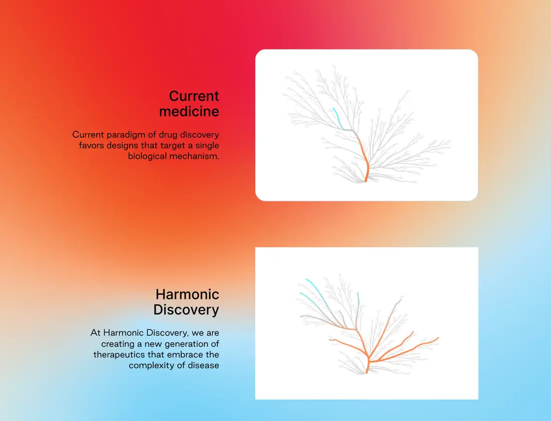
Then and now
Current medicine versus Harmonic, told with two simple line drawings.
Built on peer-reviewed science
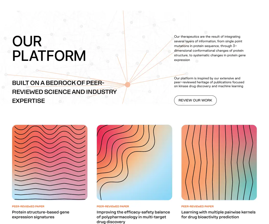
Platform and published papers sit together, each paper with its own generative artwork.
The people behind it
A portrait band introduces an international team of experts.

Up close.
Sections straight from the design. Drag to explore.

How it came together.
One shared file and short loops between design and build.
Understanding the science and who the site speaks to.
Shaping the story from current medicine to Harmonic’s platform.
Designing every section, from line art to paper covers.
Built and launched at harmonicdiscovery.com.
In their words
More work we’re proud of
Two more projects, designed and built end to end.