Designing a website for Dragon Notes, the notetaker that remembers who said what
How we gave a product that does a lot one clear story, from first sketch to launch.
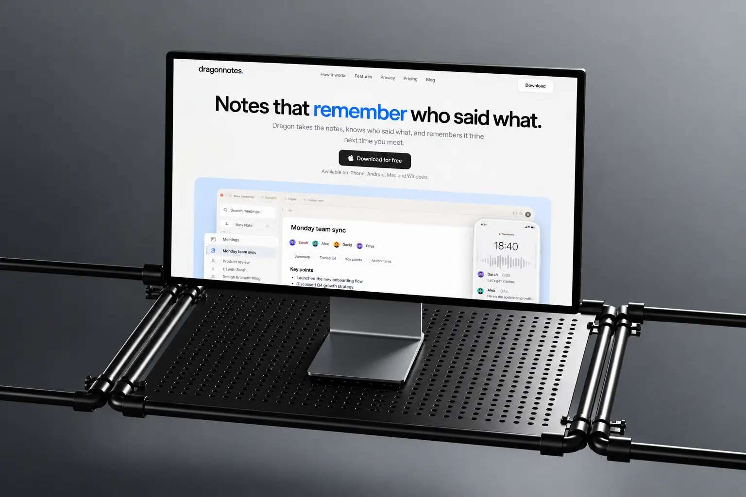
Dragon does a lot. It recognises speakers, remembers context across meetings, stays end to end encrypted and runs on every device. The website had to explain all of it in under a minute.
Dragon Notes takes the notes, knows who said what, and remembers it the next time you meet. We designed, animated and built the new site with one rule for every section: answer a single question, then get out of the way.
One colour, big type, real screens.
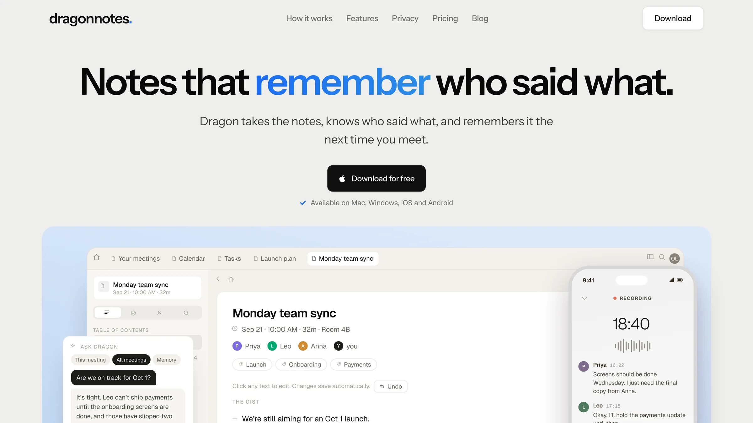
We explored two visual directions and settled on a simple system: one confident blue, generous type, and the actual product interface in place of illustrations.
Details that do the explaining.
Scroll through the page with us. The view moves to each decision as you read.
The whole page, one idea
Every block answers a single question about the product, top to bottom.
One word in blue
The headline carries a single accent. Everything around it stays quiet, so it lands.
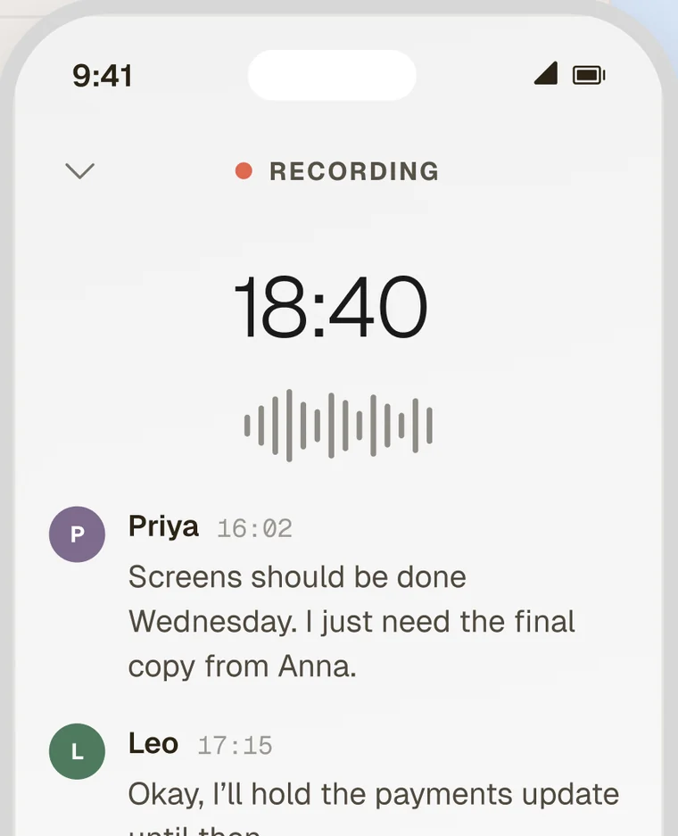
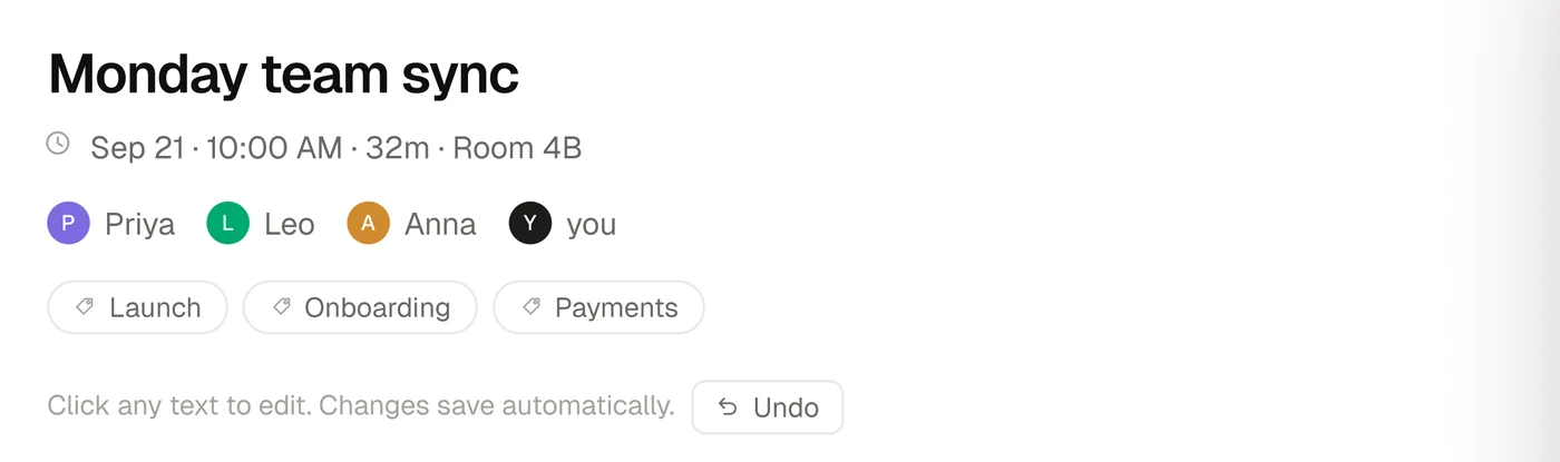
Who said what
Every speaker gets a name and a colour, so the promise shows before you read a line.
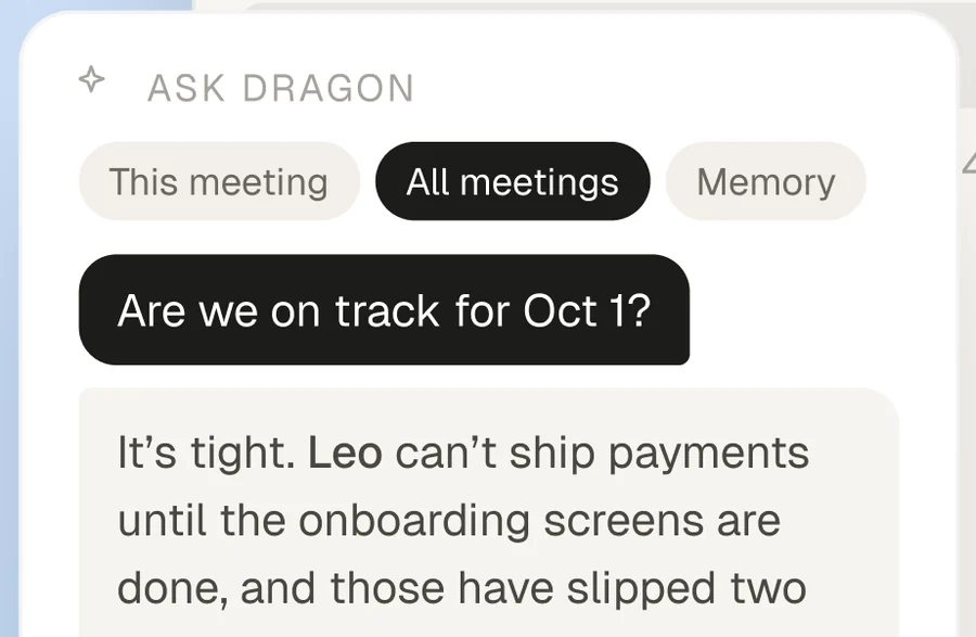
Memory, shown
Ask Dragon answers from past meetings, using the real interface instead of a drawing.
Desktop and mobile together
The phone sits beside the desktop app, and on scroll it slides into the next section.
Up close.
Crops straight from the live site. Drag to explore.
How it came together.
One shared file and short loops between design and build.
Using the product in real meetings and agreeing on the pages.
Two visual directions, one refined into a simple system.
Five page templates for desktop and mobile, with motion planned in.
Developed on WordPress, tested across devices, then launched.
“OhhMyDesign was open to all my feedback and quick to turn changes around. We wanted the site to show off our app’s key features while keeping it simple, and they really got that.”

More work we’re proud of
Two more projects, designed and built end to end.