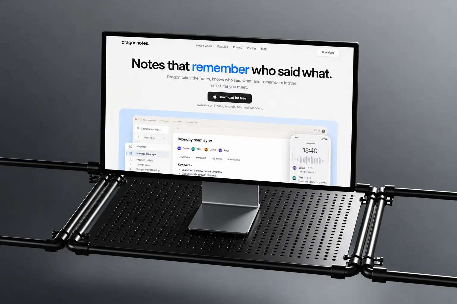
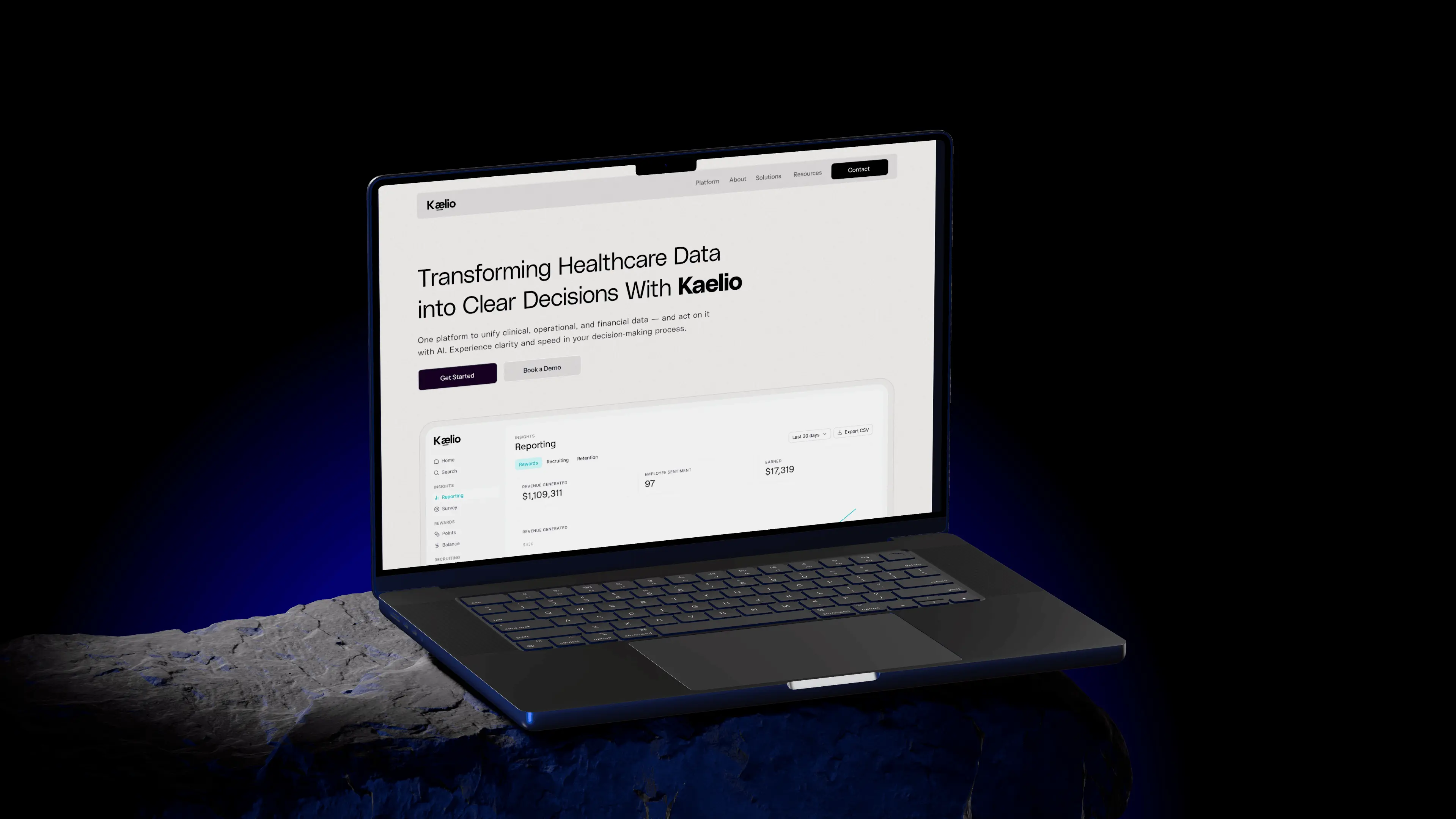
Designing a website for Corgi Labs, accept more payments and block more fraud
How we made fraud prevention feel friendly, clear and easy to start.
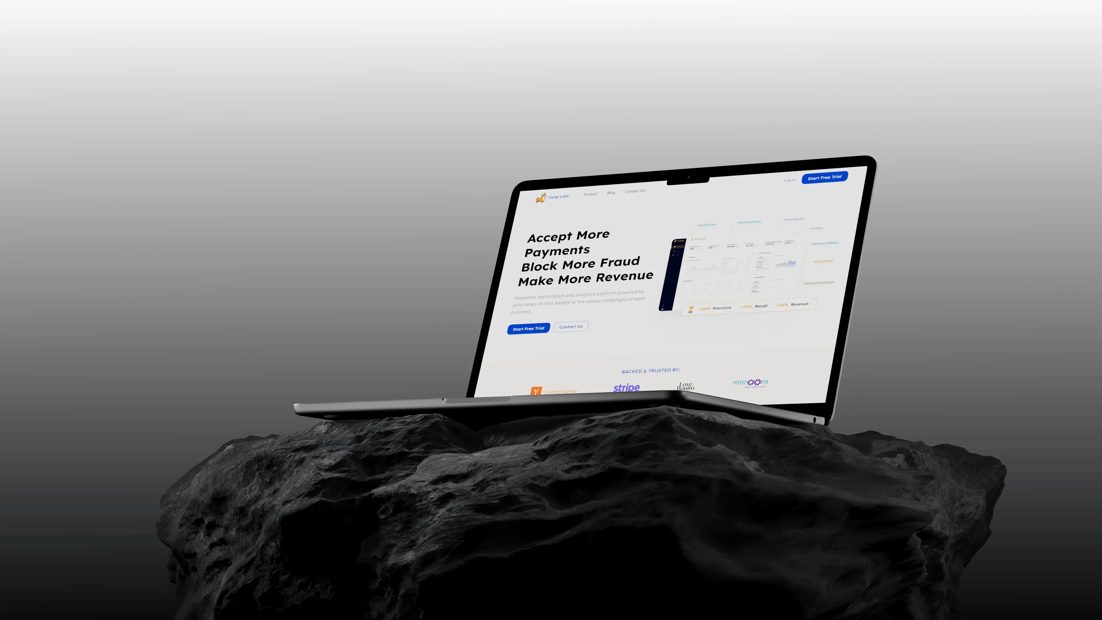
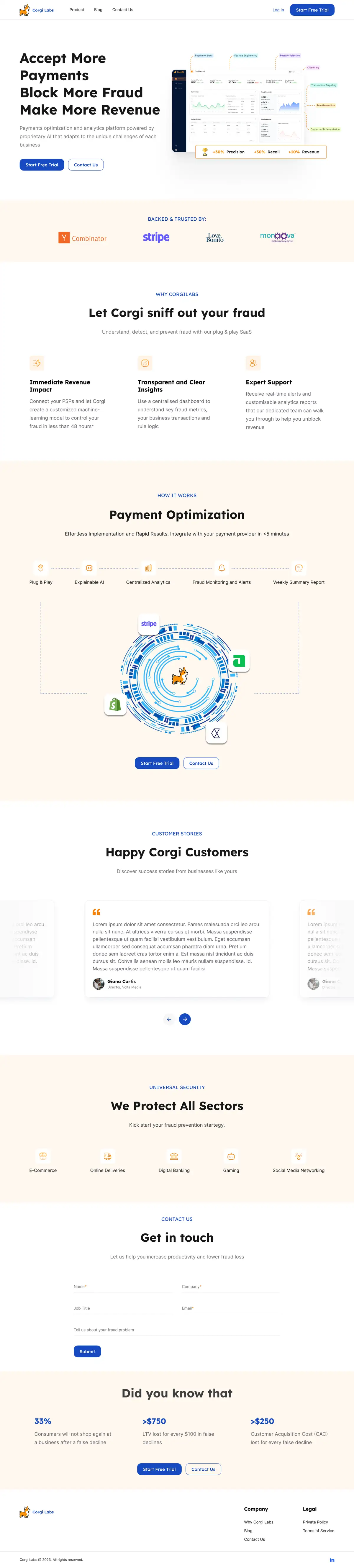
Corgi Labs uses AI to optimise payments and stop fraud, plugged into the providers businesses already use. The site had to make a serious problem feel easy to solve.
We designed the full Corgi Labs website with a confident blue, a warm cream background and the corgi itself at the centre of how the product works.
Friendly, but serious about fraud.
A strong blue for trust, a warm cream for approachability and a pop of corgi orange.
Details that do the explaining.
Scroll through the page with us. The view moves to each decision as you read.
The first screen
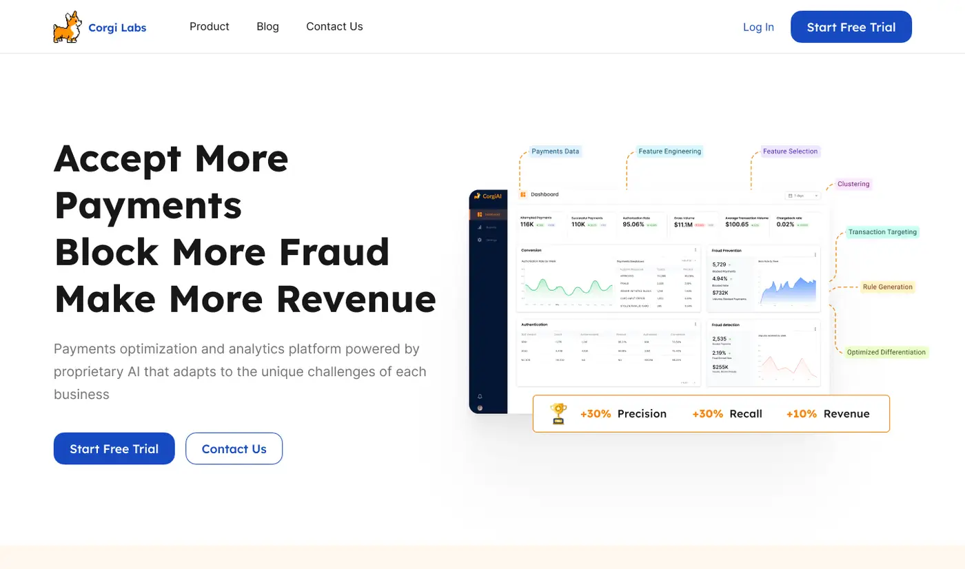
A four-line promise beside the real analytics dashboard.
Accept more, block more, make more
Four short lines, each a clear outcome.
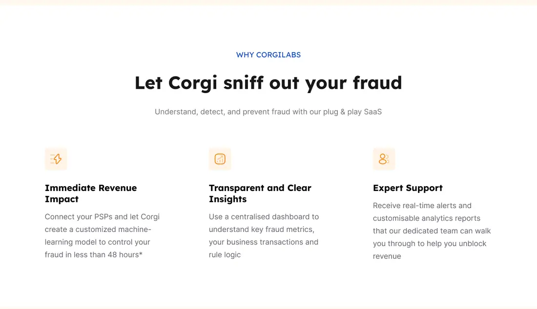
Let Corgi sniff out your fraud
Three clear benefits with simple icons.
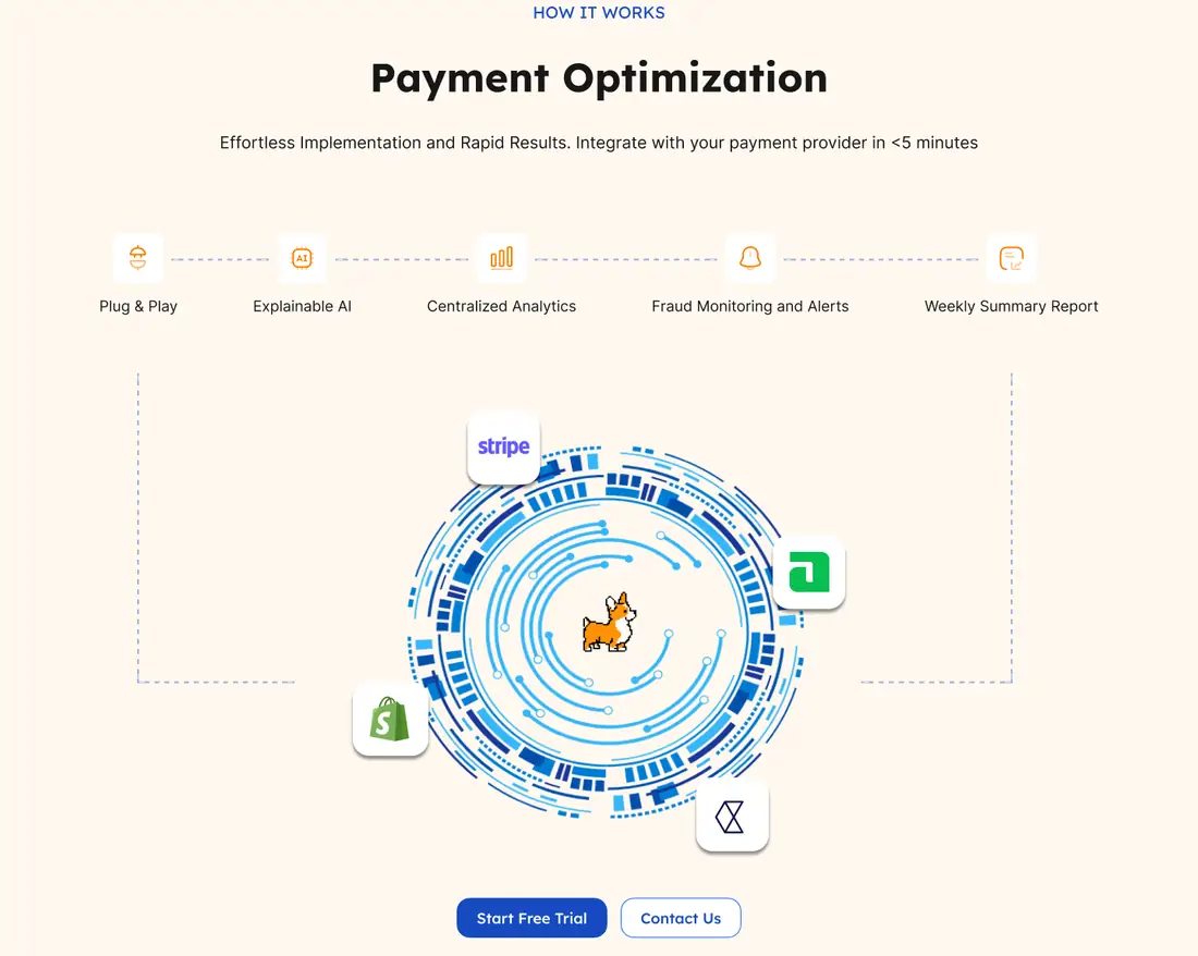
Payment optimization
Integrations orbit the corgi in one memorable graphic.
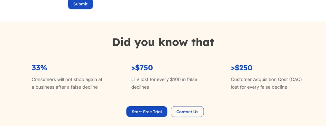
Did you know
Three industry numbers that make the cost of fraud real.
Up close.
Sections straight from the design. Drag to explore.
How it came together.
One shared file and short loops between design and build.
Understanding the product and the payment teams it serves.
Ordering the page from promise to how it works.
Designing every section with a friendly brand touch.
Built and launched at corgilabs.ai.
More work we’re proud of
Two more projects, designed and built end to end.